Redlining is receiving renewed and long overdue attention in research and media circles—recognition that federally-sanctioned segregationist housing policies in the last century helped shape the enormous racial/ethnic inequities in neighborhood opportunity we observe today.
Changes in neighborhood boundaries over the past one hundred years have made it difficult to understand this racist practice’s full impact on health. The consequences of redlining on community conditions today are evident: redlining has been linked to subsequent long-term disinvestment, segregation and lack of opportunity in areas predominantly populated by Black, Hispanic and immigrant communities. More recently, research has shown how redlining contributed to large and persistent racial/ethnic wealth gaps and health inequities. But precise comparisons between a grade given to a neighborhood in the 1930s and the health outcomes of its current residents have been challenging.
Using data and maps published by the Digital Scholarship Lab at the University of Richmond, we have developed a novel method of classifying present-day neighborhoods (census tracts) according to their 1930s Home Owner Loan Corporation (HOLC) grades. Our data are now publicly available. We hope that these data will facilitate further research on the impact of redlining on present-day outcomes, inform community conversations on the repercussions of structural racism and help today’s leaders develop new policies aimed at improving neighborhood equity.
Here, we outline the challenges involved in mapping historic HOLC ratings onto today’s neighborhoods, provide an overview of our new approach and offer insights for using this data. A more detailed discussion of our methods can be found in our article Connecting past to present: Examining different approaches to linking historical redlining to present-day health inequities, which has recently been published in PLOS ONE.
The Home Owner Loan Corporation assigned letter grades to neighborhoods, with better grades reserved for affluent, White neighborhoods.
In the 1930s, HOLC created maps of U.S. cities that were meant to quantify variation in real estate credit risk. Created as part of a New Deal program to assist struggling homeowners, HOLC tasked local officials with creating neighborhood maps that captured credit default risk across neighborhoods. In this process, officials assigned neighborhoods to one of four color-coded letter grades: D = “hazardous,” C = “definitely declining,” B = “still desirable” and A = “best.” “A” ratings were often assigned to affluent White neighborhoods, while “D” ratings were often assigned to neighborhoods that had a greater share of Black, lower class or immigrant residents. The area descriptions produced at the time for each neighborhood illustrate pervasive racial bias in the rating process, as they downgraded areas based on their racial/ethnic composition. D-rated neighborhoods were marked in red on HOLC maps, which gave rise to the term “redlining.”
These ratings channeled the flow of real estate credit into affluent, White neighborhoods, while depriving communities of color of much-needed investments. They legitimized racist appraisal and underwriting practices.
The research problem: Present-day neighborhoods (census tracts) often overlap with multiple HOLC-rated neighborhoods that were assigned different letter grades.
When examining about 15,000 census tracts from 2010 that were fully or partly covered by HOLC-rated areas, we found that 60% of those census tracts intersect with multiple HOLC-rated areas that have different ratings. In other words, over half of present-day neighborhoods were covered by two, three or even four different HOLC grades. These intersections complicate the process of classifying today’s tracts in terms of historical HOLC ratings. If a census tract intersects with two differently rated HOLC areas, how should we classify it? Do we only consider the rating covering the larger portion of the tract? Can the rating covering a smaller portion of the tract be ignored entirely? To put it another way: Does a tract that is 55% covered with A-rated area and 45% covered with D-rated area belong to the same class as a tract that is 95% A-rated and 5% D-rated?
Our solution: We created a new method of classifying present-day census tracts intersecting with multiple HOLC ratings.
After reviewing approaches taken in other studies, we derived a new and predictively optimal method of classifying census tracts in terms of 1930s HOLC ratings. We are pleased to share these new census tract HOLC rating data for both 2010 and 2020 census tracts. These data contain the proportion of each census tract’s area covered by A, B, C and D HOLC ratings, as well as census tract classifications that synthesize multiple grades into parsimonious and predictively optimal classifications—for example, “Mainly A” or “Mainly B, some A.” Our recently published PLOS ONE journal article describes in greater detail how we created these classifications.
We used machine learning to determine how to optimally combine information on multiple ratings.
Machine learning provides us with tools to classify census tracts in a way that is both practical for researchers and optimal for predicting present-day neighborhood-level outcomes. We created 54 different classifications for how tracts with multiple HOLC grades can be classified. For example, our classifications differ by whether they consider only the rating covering the largest portion of the census tract, or also ratings that cover the second, third or fourth-largest portion. We used cross-validation and OLS regression to examine how well each classification predicted six neighborhood outcomes, such as the Child Opportunity Index 2.0 and life expectancy in present-day census tracts. Cross-validation helped us identify the classifications that explain much of the variation in present-day outcomes without excessive detail.
We derived four-level and ten-level census tract classifications that most users will find suitable.
We published three census tract classifications—each a different tradeoff between how detailed the classification is and how predictively accurate it is.
First, we offer a four-level classification that is likely most practical for many uses. The classes correspond to the four HOLC letter grades: “Mainly A,” “Mainly B,” “Mainly C” and “Mainly D.”
Second, we offer a ten-level classification that is more complex but performs better in terms of predictive accuracy. For tracts covered by multiple HOLC ratings, the ten-level classification considers both the rating covering the most area and the rating covering the second most area. It takes seriously the fact that census tracts are often covered by differently rated HOLC areas and leverages this information efficiently.
The figure below, which shows the average COI 2.0 Child Opportunity Score for tracts according to the four-level classification and the ten-level classification, illustrates the additional nuance provided by the ten-level classification. The Child Opportunity Score measures neighborhood opportunity for children based on 29 component indicators on a scale from 1 to 100.
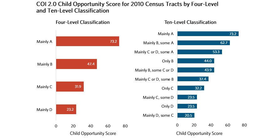
In both the four-level and ten-level classifications, the difference in neighborhood opportunity today is about 50 points between Mainly A- and Mainly D-rated census tracts. However, the pattern for the ten-level classifications reveals the importance of secondary ratings. For example, the four-level classification shows that a “Mainly B” neighborhood has an average Child Opportunity Score of 47.4. The ten-level classification reveals that the same neighborhood could have a score as high as 62.7 if it also largely intersected with A-level neighborhoods—or as low as 43.9 if it instead intersected with C- or D-level neighborhoods.
Finally, the published data file also includes a 40-level classification that achieved the highest levels of predictive accuracy. This classification is too detailed for use cases other than predictive modeling. Our evaluation also found that the ten-level classification comes close to matching the predictive accuracy of the 40-level classification.
Additional research on the effects of structural racism is needed.
Redlining is one, but by no means the only, example of institutional racism in the U.S. housing sector. While legislation such as the Fair Housing Act sought to combat redlining, less overt forms are still practiced today. More research on the long-term effects of redlining and similarly racist policies and practices in housing and other sectors is needed to unpack and redress the insidious effects of structural racism and the damage it has inflicted on Black, Hispanic and immigrant neighborhoods and populations. Such efforts can support public engagement processes that illuminate structural racism and policies that combat it. We hope that the publication of our data, building on the seminal work by the Digital Scholarship Lab, will facilitate these efforts.
Explore the data: 1930s Home Owner Loan Corporation (HOLC) neighborhood grades for U.S. census tracts
Learn more about our project From Redlining to Child Opportunity: Confronting systemic racist residential segregation
Learn more about racial/ethnic patterns in child opportunity across neighborhood's today